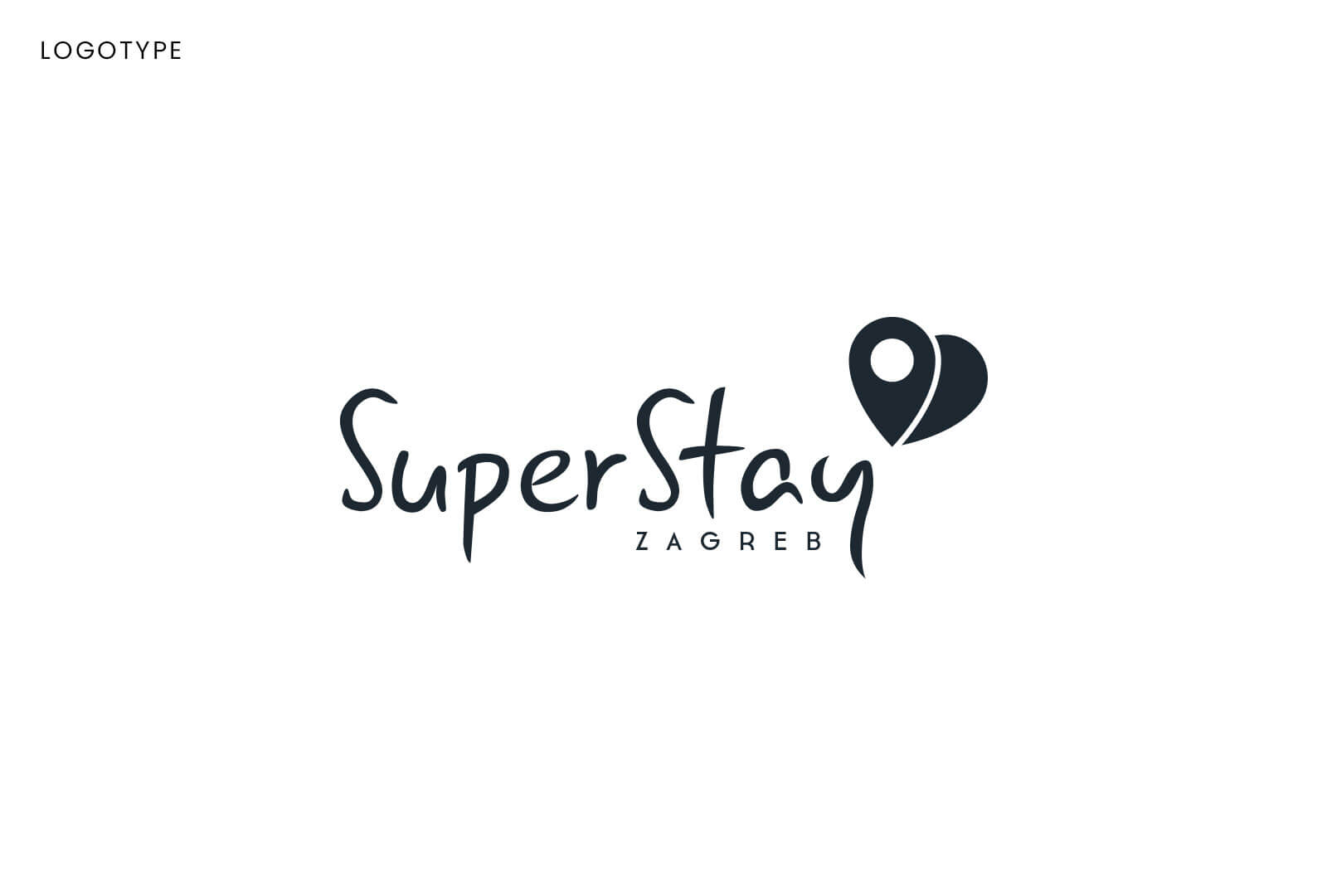
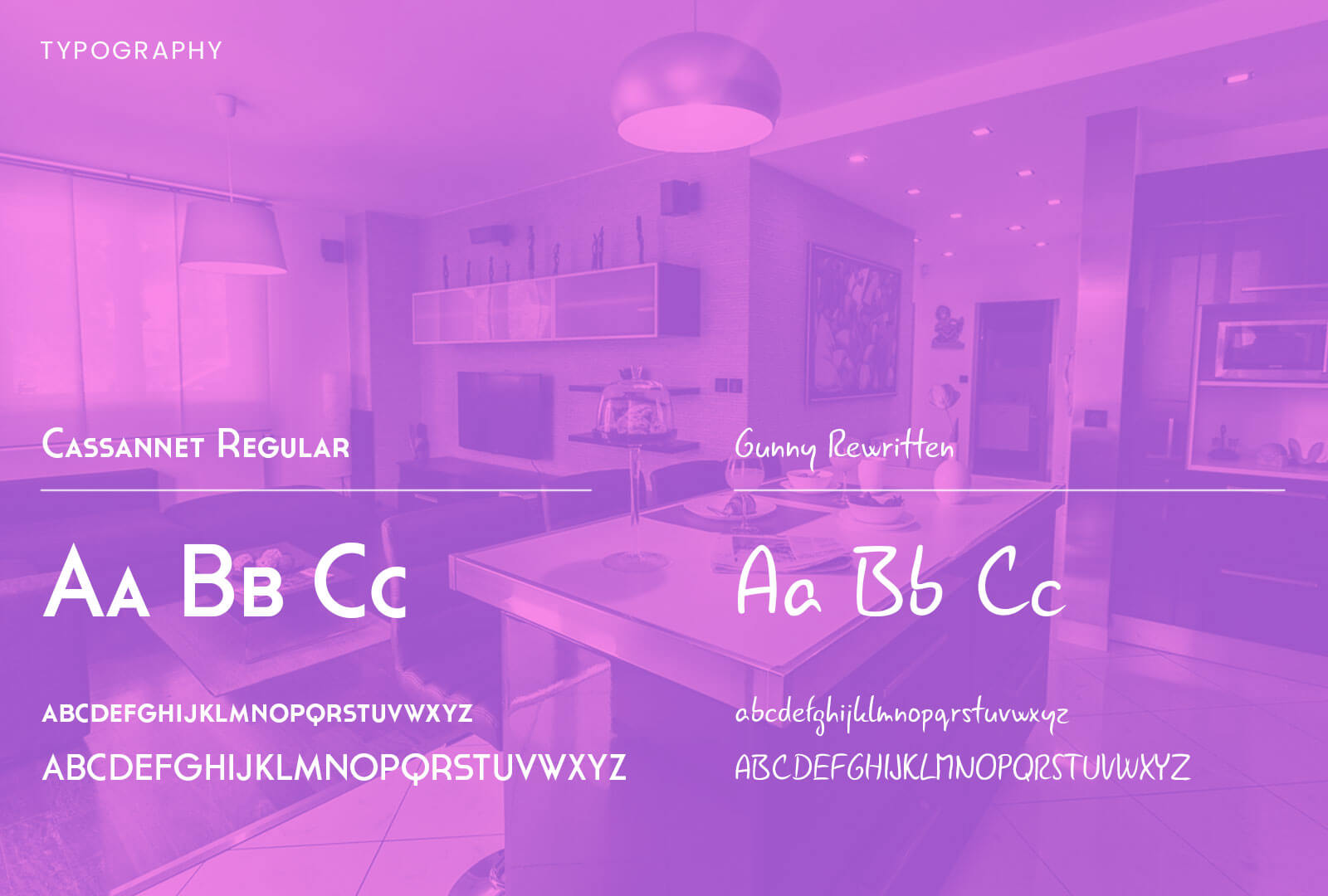
Super Stay Apartments are short-term and long-term rental apartments in Zagreb, Croatia. Designing a logo for them was a fun project – they had a clear picture of what they want, and were always ready with all the needed information, but were also very open to all the suggestions and recommendations.
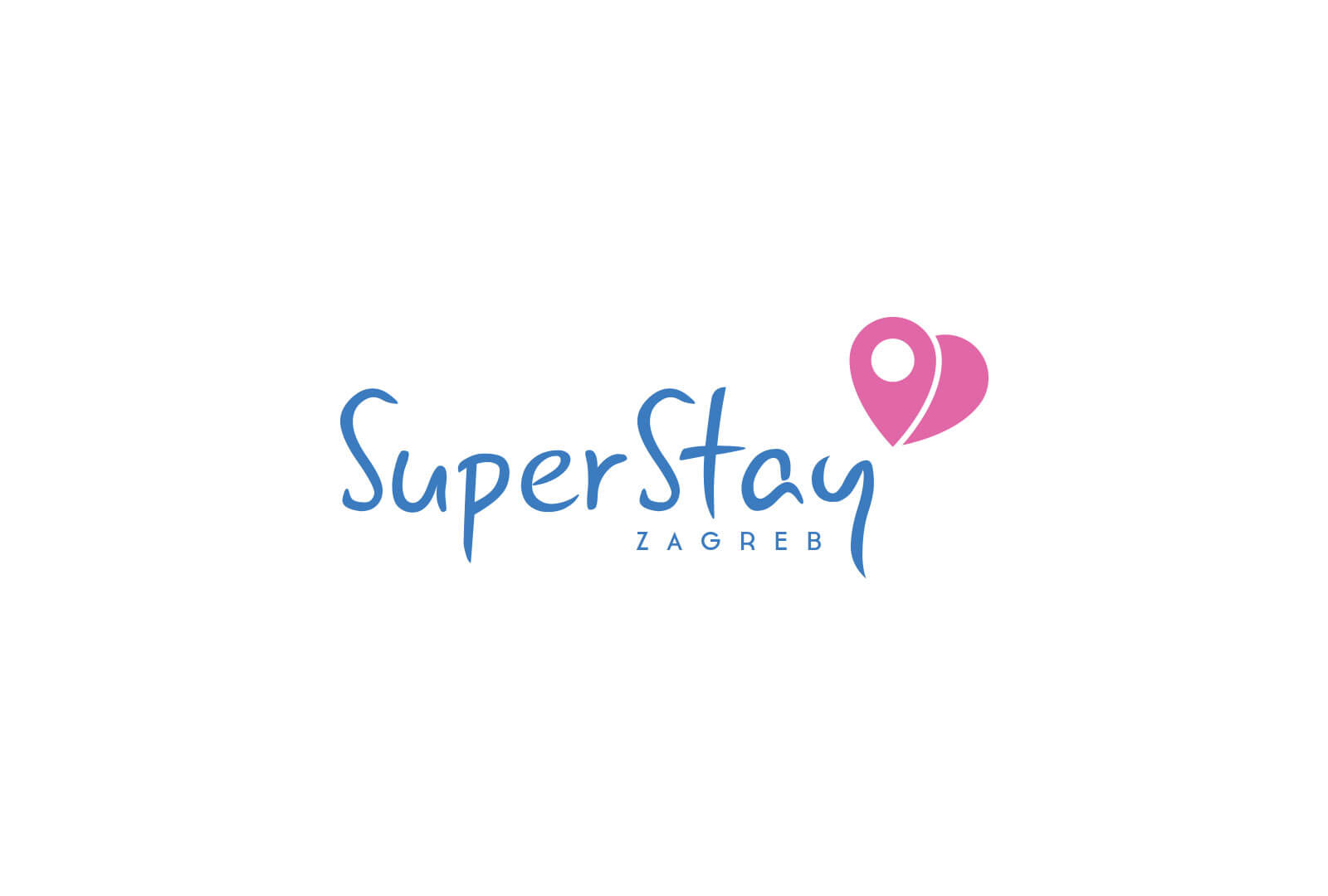
Idea for the logo
Their vision was to make their apartments a “home away from home” for all the travelers and tourists that stay with them. They want their customers to feel at home with all they may need. They offer beautifully furnished apartments for top-tier comfort.
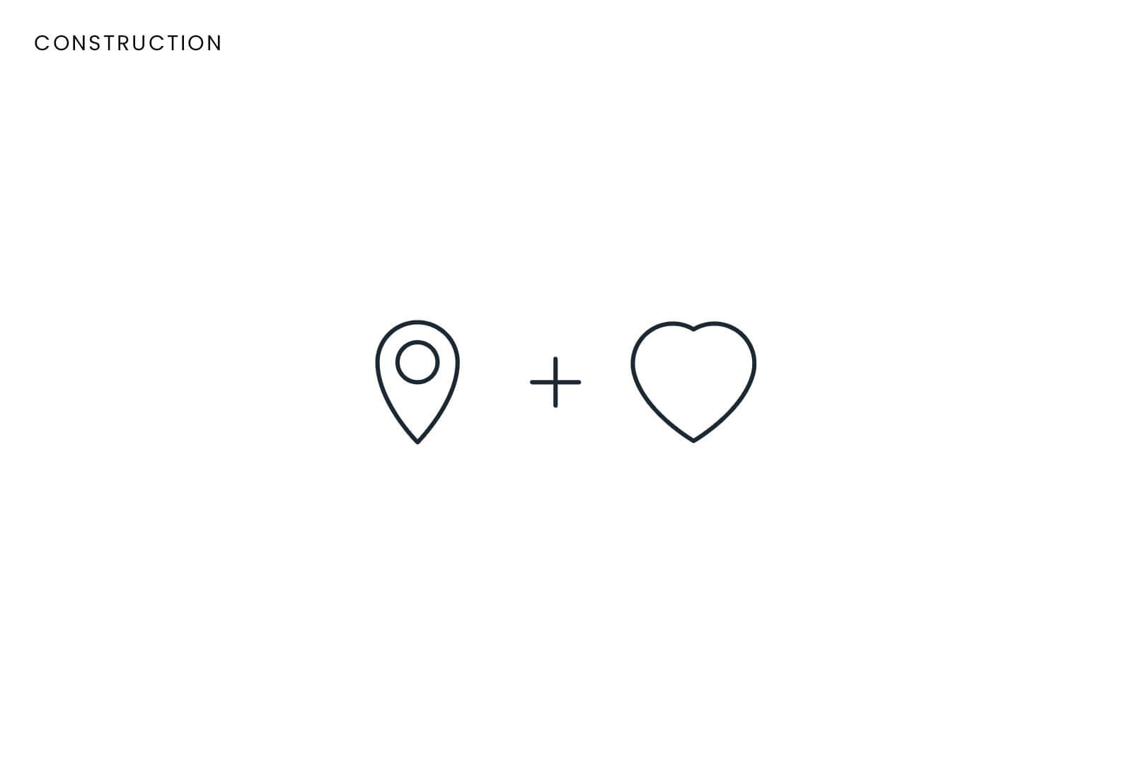
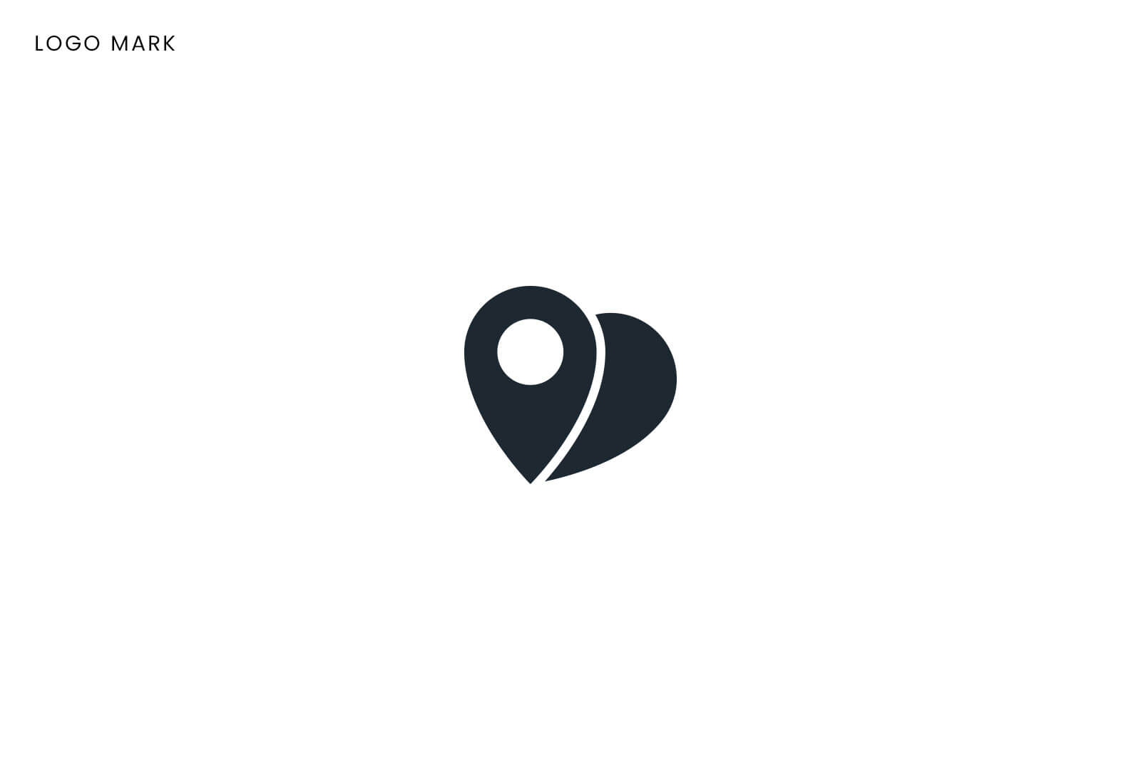
For the logo mark I combined two symbols that represent them most accurately: Location pin – representing maps, travel and destination. In this case THE destination. Heart – love, home and comfort.
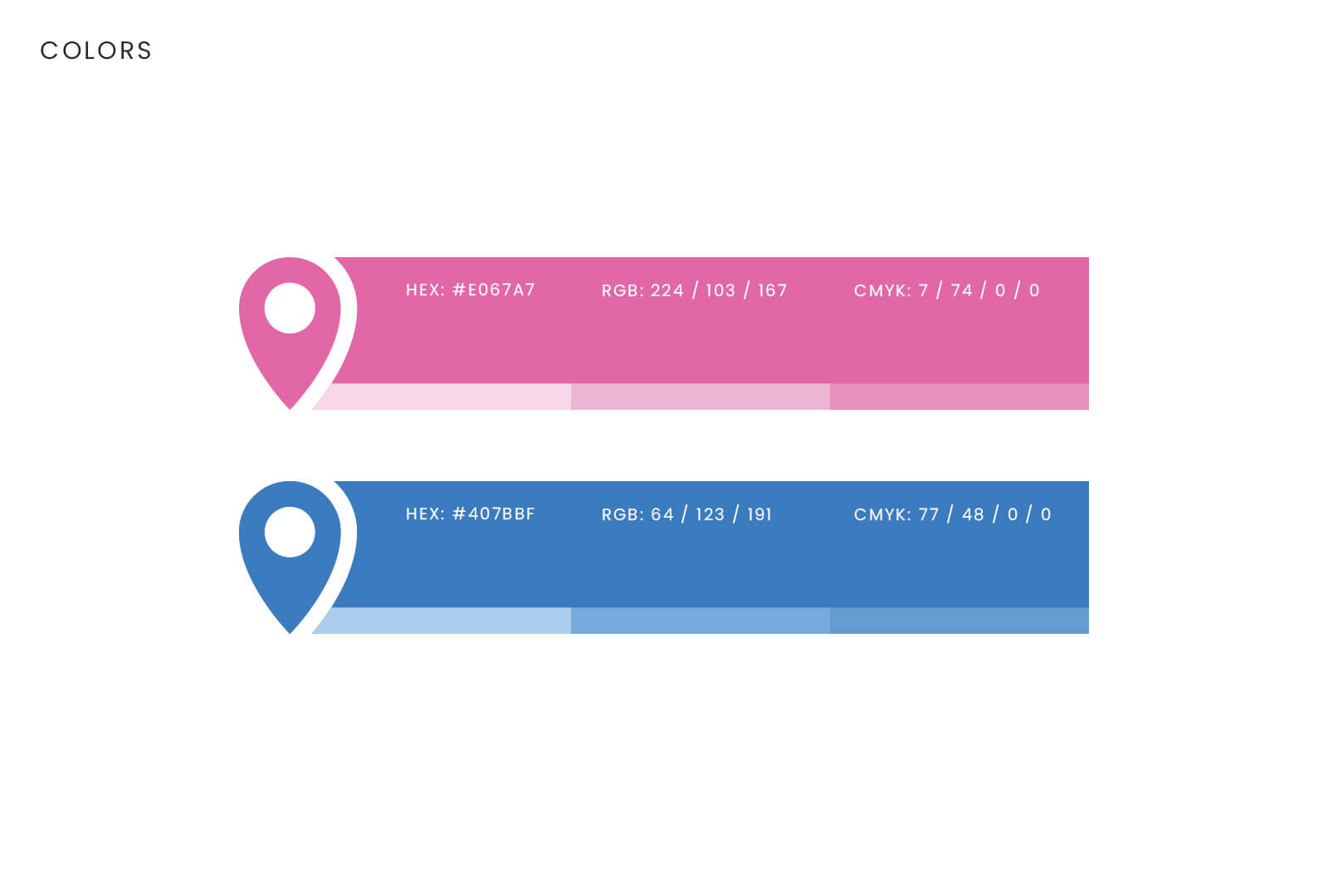
For the colors we opted for two often opposite colors – pink and blue. Blue is color of Zagreb (though in another shade), and pink is often associated with love and care.